Some data tables can be very wide and many times it is necessary. To make any sense in a table, single row of data should be put together. Tables are flex in width, but they start wrapping cells contents uncomfortably or just plain can’t get any narrower.
By responsive design, we can adjust designs to accommodate screens of different size of screens. So what happens when a screen is narrower?
Let see …
We’re using CSS @media queries to detect screen size & re-arrange the table data.
CSS:
table{border-collapse:collapse; width:100%;}
th,td {border:1px solid #ddd; padding:10px;text-align:left;}

@media all and (max-width:991px){
 .hidden-sm {display:none !important;}
 #responsive-table{font-size:13px;}
 #responsive-table table,
 #responsive-table thead,
 #responsive-table tbody,
 #responsive-table th,
 #responsive-table td,
 #responsive-table tr{display:block;}
 #responsive-table tr{border:1px solid #ddd;margin-bottom:30px;}
 #responsive-table td{border:none;border-bottom:1px solid #ddd;position:relative;padding:5px 0 5px 40%;white-space:normal;text-align:left; margin:0; font-style:normal;}
 #responsive-table td:before{position:absolute;top:6px;left:6px;width:40%;padding-right:10px;white-space:nowrap;text-align:left;color:#333;}
 #responsive-table td:before{content:attr(data-title);color: #dc4343;}
 #responsive-table td:last-child{border-bottom:none;}
 }
& Some HTML:
<div id=”responsive-table”>
<table>
<tr class=”hidden-sm”>
<th>Name</th>
<th>Course</th>
<th>Percentage</th>
</tr>
<tr>
<td data-title=”Name”>John Doe</td>
<td data-title=”Course”>MBA</td>
<td data-title=”Percentage”>99%</td>
</tr>
<tr>
<td data-title=”Name”>Jane Doe</td>
<td data-title=”Course”>B.Tech</td>
<td data-title=”Percentage”>88%</td>
</tr>
</table>
</div>
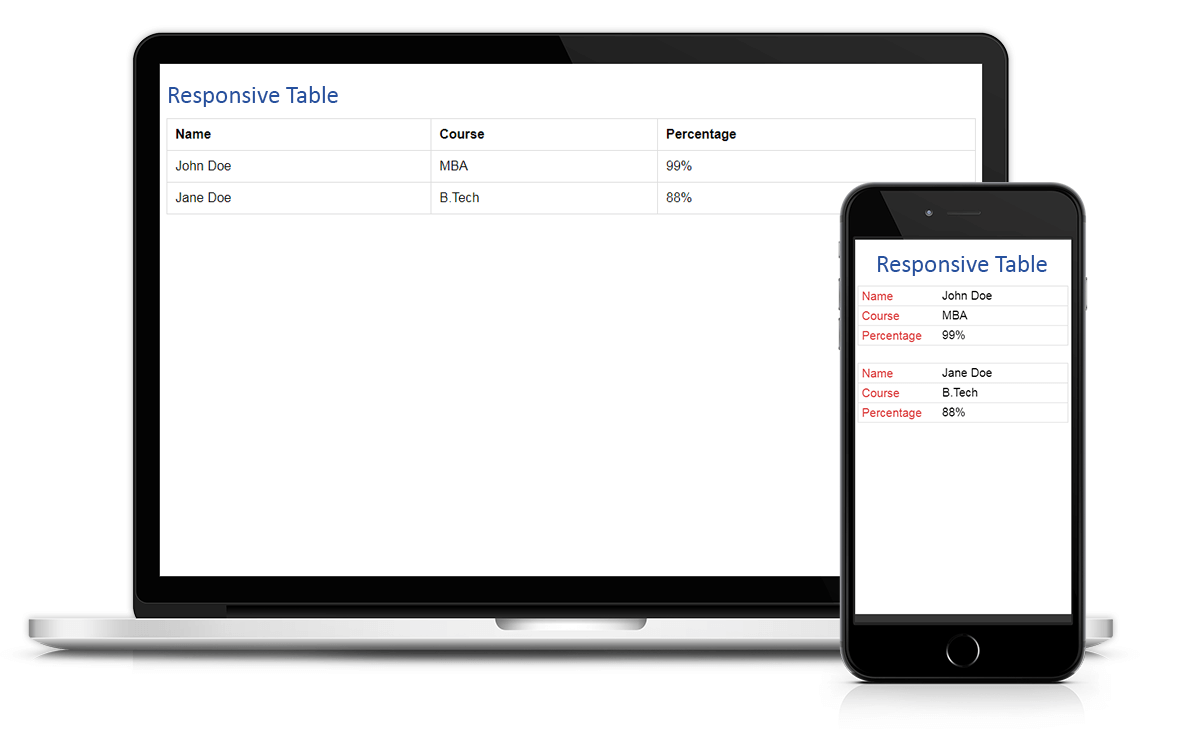
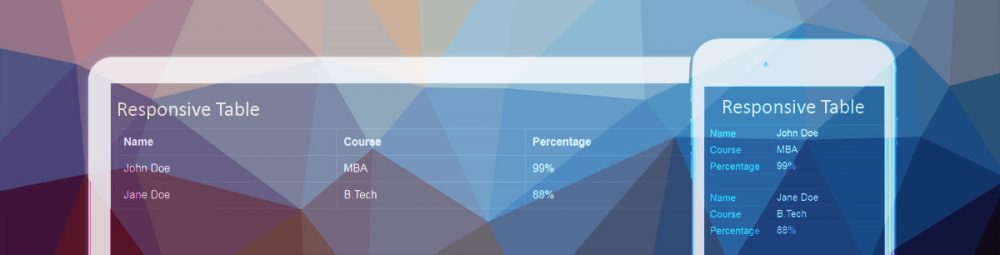
Preview: